Thursday 14 December 2006
Wednesday 13 December 2006
26 Letters Movie
I have uploaded my 26 Letters movie file to you Tube - the link is here:
I really enjoyed doing this in the end, although it was a bit of a baptism of fire in the world of motion graphics and After Effects. I spent most of the time allocated for this brief on the paperwork, and read the book Moving Type: Designing for Time and Space by Matt Woolman and Jeff Bellantoni, which was pretty much the perfect book to research this brief. the only real problem was that by the time I worked out what I had to do, I had run out of time, but I feel it was worthwhile as I now understand the medium a lot more.
The piece itself is exactly what was on my paperwork, and as a result I think it could actually be edited a bit tighter to the music, as it might be slightly out by a frame or two, and I could easily fix this, but at the moment I have to get on with the next assignment in flash.
Sunday 10 December 2006


26 Letters 1

The next assignemnt after the Juxtaposition thing was "26 Letters". The first part of this involved finding the shapes for 26 letters whilst out and about, photographing them until we had a curtom aphabet. We then traced all the shapes in Illustrator.
The second part of this brief was to make an After Effects movie, animating the shapes to music.
Friday 8 December 2006
Beck.com

This site for Beck by Hi-Res is excellent. lots of fun, loads of content, fantastic combination of image, information and music and just very groovy. This is definitely the kind of thing I would like to do.

Modernism

I am currently looking at doing my first Flash site, and have looked at many for research, but particulary like this one. The animation and navigation works really well, and it has a lovely vibe. The combination of animation and design also works well, juxtaposing the classic and historical modernist them with modern technolgy.
Saturday 25 November 2006
Science Museum
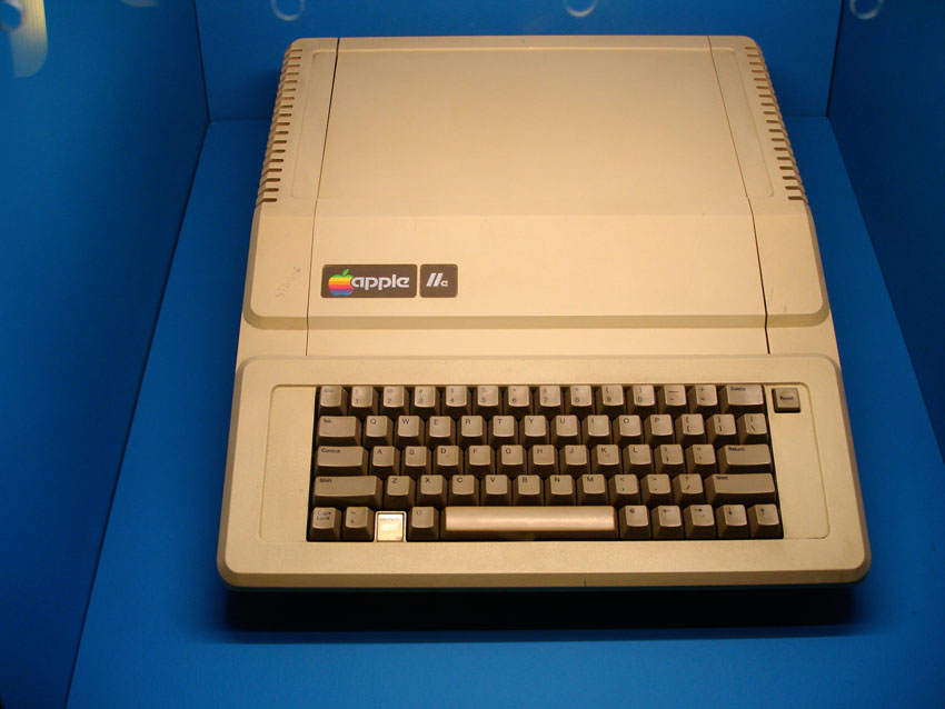
Vintage Computers at The Game On Exhibition. These Macs were used for pioneering computer graphics in their time.
Friday 24 November 2006
London trip
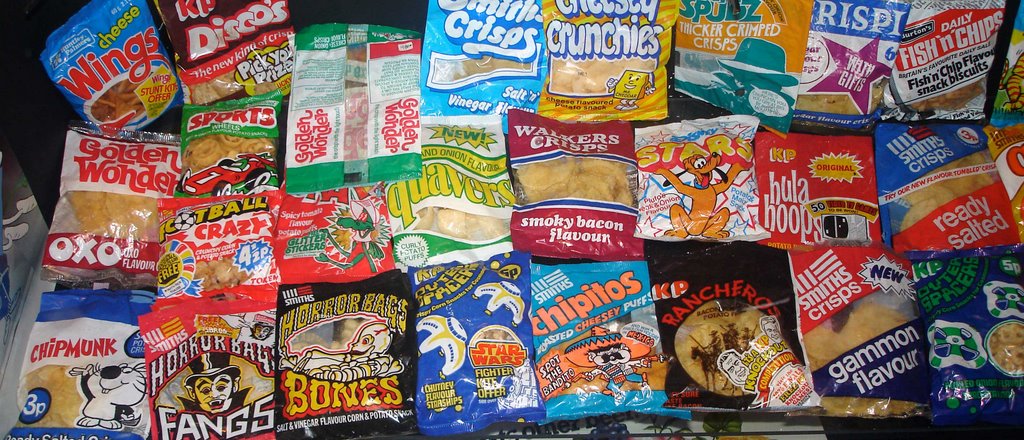
Vintage Junk Food I used to eat myself as a youngster at the Brands and Packaging Museum
Thursday 23 November 2006
Juxtaposition Assignment
After undertaking various introductory assignments we have been given our first main assignments with "Juxtaposition". I found this initially quite hard as I had to implement a number of new things such as the 5 stage plan, working on paper, worksheets and using software I had until then not used much.
The 3 briefs were:
Friday 17 November 2006
Black_nwhite_print1.jpg

I found for this i could come up with many ideas on my worksheets, mindmaps etc, but actually ended up trying a lot of variations on the theme before i could get something that works. I feel the resulting image is good, and I admit going through a lot of trial and error to get there.
I had taken a lot of images before this one, and the quality of my photography wasn't really good enough. I came to conclusion in the end that a lot of contrast was needed, and sought help from Colin in the Hub.
Silence Print1.jpg

This image gave me the best experience as it meant i had to work harder on the computer and try as many new things as possible. I had tried many variations on my worksheets, and found I had to try the photos then go back to the worksheets to change the composition, the lighting and work with "models" (who are just other students who were about at the time).
The Photoshop side of things were also most rewarding, and it took longer to put this image together then the other two combined. I don't know if the final result looks better than the other two, but I feel i leaned the most from this one.
The one below is the original image, and the one above is one where i tried to place it in a public location (a billboard).

Blowin Print1.jpg

I had gone through various stages on research and wanted to do this idea based on a bi-polar idea. On paper this i felt was my strongest idea, yet when going into production I felt i hadn't got the right photos to begin with.
I had tried a lot of shots of myself, trying all manner of odd things to try and look manically happy of really depressed, but the photos probably weren't good enough. I went on to put the image together in photoshop anyway, and added the ring binder idea, as i wanted to do some sort of split book, or flick-book thing.
I still feel if I could have got an actor or someone to get better photographs, the idea might work better, and I might yet try and do this. Unfortunately at the moment I don't think it works.