Wednesday 28 March 2007

Colour


I have been really into getting a grip on colour over the past few months. Various methods have been utilsed, such as taking screen shots of great colour combinations and creating custom swatches, or using the Colour Palette Generator.

The character design brief also helped, as it made me think of reduced colour palettes, and by screen printing you can make a fresher image that is more within a tradition of graphic design, and gives variety from the usual web-technicolour thing.

Character Design


This brief required us to study people in their environment, take photos, go out and sketch and observe people. We then had to explore various media to compose and illustration. Screen and Mono printing were encouraged and we were given more time to finish and experiment.

I admit to having trouble initially getting the characters and environment down in my sketchbook, as I felt a bit paranoid trying to draw and photo strangers in Wrexham. It's the kind of thing that could land you with a punched face. My kids luckily were on hand as plan B, and I was able to abstract my two loveable little daughters into a pair of mini gangsters. I wouldn't have considered myself “good at drawing”, but have found by repeated work on the same characters and trying lots of different ways of mark-making you can still get a good enough result.

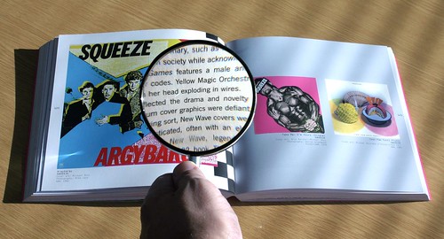
I read a book on Digital Illustration by Lawrence Zeegan which I found highly beneficial and inspiring. It helped the brief make sense, and meant I was able to recognise the methods the tutors were suggesting and have a go at it. On reflection I think it was the easiest assignment, and the only one that didn't really stress me out. I'd love to be able to integrate this kind of thing into my design work next year.

Digital Identity


This assignment required me to analyse myself and come up with a visual identity, or a logo which could then be used for our website and so forth. I found this assignment really interesting, and created a large amount of paperwork, exploring various aspects of typography, lots photography shooting a 3d version of one logo idea, worked with brush and ink, scanning and combining all of this in the computer. I researched this quite a bit, reading Naomi Klien's “No Logo”, Christopher Simmons “Logo Lab”, and the first edition of “Logo Lounge”.

I'd love to be able to create strong iconic logos. It is something that seems simple, but I think is probably one of the most difficult things to do well in design. Paul Rand was a master of this, and I also see a lot of very interesting branding and logo work today in the motion graphics area, which I am most keen on. It seems to me that the big companies utilise talented designers to make cutting edge pieces that integrate the branding of thier companies such as Nike or MTV. Chris at Dstrukt is adept and turning typographic logos into dynamic 3d objects and basing much of this work around them.

My reflections on this project are:

I enjoyed working on it, got my hands dirty and experimented a lot, but I don't really feel that I have came up with a logo I am really happy with.

Four examples shown here show different angles. I put the most time and effort into the “K” idea, but Adam here at NWSAD didn't like it at all and urged me to use a digitised version of a hand-drawn one I did quite early in the process, as it rang true with my personality. I had trouble getting a decent reproduction from the scan, and wanted a vector version that could be used at any scale, so it was redrawn with a wacom tablet. This version (in red) was still a bit rough even though it had the right character, so I subtly reworked it again for my website with Illustrator. It will do for now, but I don't know if I'd want to use it permanently.

Friday 16 March 2007

Top Tips for Art School Fuckwits

The Top 10 Things They Never Taught Me in Design School
by Michael McDonough

1. Talent is one-third of the success equation.
Talent is important in any profession, but it is no guarantee of success. Hard work and luck are equally important. Hard work means self-discipline and sacrifice. Luck means, among other things, access to power, whether it is social contacts or money or timing. In fact, if you are not very talented, you can still succeed by emphasizing the other two. If you think I am wrong, just look around.

2. 95 percent of any creative profession is shit work.

Only 5 percent is actually, in some simplistic way, fun. In school that is what you focus on; it is 100 percent fun. Tick-tock. In real life, most of the time there is paper work, drafting boring stuff, fact-checking, negotiating, selling, collecting money, paying taxes, and so forth. If you don’t learn to love the boring, aggravating, and stupid parts of your profession and perform them with diligence and care, you will never succeed.

3. If everything is equally important, then nothing is very important.
You hear a lot about details, from “Don’t sweat the details” to “God is in the details.” Both are true, but with a very important explanation: hierarchy. You must decide what is important, and then attend to it first and foremost. Everything is important, yes. But not everything is equally important. A very successful real estate person taught me this. He told me, “Watch King Rat. You’ll get it.”

4. Don’t over-think a problem.
One time when I was in graduate school, the late, great Steven Izenour said to me, after only a week or so into a ten-week problem, “OK, you solved it. Now draw it up.” Every other critic I ever had always tried to complicate and prolong a problem when, in fact, it had already been solved. Designers are obsessive by nature. This was a revelation. Sometimes you just hit it. The thing is done. Move on.

5. Start with what you know; then remove the unknowns.
In design this means “draw what you know.” Start by putting down what you already know and already understand. If you are designing a chair, for example, you know that humans are of predictable height. The seat height, the angle of repose, and the loading requirements can at least be approximated. So draw them. Most students panic when faced with something they do not know and cannot control. Forget about it. Begin at the beginning. Then work on each unknown, solving and removing them one at a time. It is the most important rule of design. In Zen it is expressed as “Be where you are.” It works.

6. Don’t forget your goal.
Definition of a fanatic: Someone who redoubles his effort after forgetting his goal. Students and young designers often approach a problem with insight and brilliance, and subsequently let it slip away in confusion, fear and wasted effort. They forget their goals, and make up new ones as they go along. Original thought is a kind of gift from the gods. Artists know this. “Hold the moment,” they say. “Honor it.” Get your idea down on a slip of paper and tape it up in front of you.

7. When you throw your weight around, you usually fall off balance.
Overconfidence is as bad as no confidence. Be humble in approaching problems. Realize and accept your ignorance, then work diligently to educate yourself out of it. Ask questions. Power – the power to create things and impose them on the world – is a privilege. Do not abuse it, do not underestimate its difficulty, or it will come around and bite you on the ass. The great Karmic wheel, however slowly, turns.

8. The road to hell is paved with good intentions; or, no good deed goes unpunished.

The world is not set up to facilitate the best any more than it is set up to facilitate the worst. It doesn’t depend on brilliance or innovation because if it did, the system would be unpredictable. It requires averages and predictables. So, good deeds and brilliant ideas go against the grain of the social contract almost by definition. They will be challenged and will require enormous effort to succeed. Most fail. Expect to work hard, expect to fail a few times, and expect to be rejected. Our work is like martial arts or military strategy: Never underestimate your opponent. If you believe in excellence, your opponent will pretty much be everything.

9. It all comes down to output.

No matter how cool your computer rendering is, no matter how brilliant your essay is, no matter how fabulous your whatever is, if you can’t output it, distribute it, and make it known, it basically doesn’t exist. Orient yourself to output. Schedule output. Output, output, output. Show Me The Output.

10. The rest of the world counts.
If you hope to accomplish anything, you will inevitably need all of the people you hated in high school. I once attended a very prestigious design school where the idea was “If you are here, you are so important, the rest of the world doesn’t count.” Not a single person from that school that I know of has ever been really successful outside of school. In fact, most are the kind of mid-level management drones and hacks they so despised as students. A suit does not make you a genius. No matter how good your design is, somebody has to construct or manufacture it. Somebody has to insure it. Somebody has to buy it. Respect those people. You need them. Big time.

Wednesday 7 March 2007

Merkins


Our record label "Curfew" releases dance music, and whereas at one time it was about the packaging of vinyl records, these days it is increasingly all sold on the web as mp3's on sites like Beatport.

These are possible web banners / graphics for those sites. I wanted to try working with colour, and a like the 3d type idea, although this is all done with a small rectangle. I am still not sure whether it looks right, but it is miles better than the last ones i did three months ago. I hope to be able to master this stuff in the next year or so, as I could get plenty of work. I know everyone in that particular niche market.

As a general thing, I really want to work on my basic design skills, composition, layout, grid, just get my eye working better! Where possible I would like to do plenty of these little jobs alongside my college work. I am never really happy with my composition so far, but am confident that it will fall into place with more practice.

Tuesday 6 March 2007

Non-Format


Non-Format is a creative team comprising Kjell Ekhorn (Norwegian) and Jon Forss (British). They work on a range of projects including art direction, design and illustration for music industry, arts & culture, fashion and advertising clients.

I really like their typographic work. It has that graphic design thing but pushes the envelope a bit. They obviously know their stuff, but their designs aren't conservative. I also really like the way many of them are black and white, no mid-tones, and still work really well. It's powerful stuff. I hope over the next year (or 2 if i do the BA course 3rd year) to be able to try many typographic "experiments", like limited colour palletes, black and white or a bit of print work. I hope this will give me more ideas to "cash in" later when I leave.

Friday 2 March 2007

Airside


I have been a huge fan of Airside's work before I'd ever heard of them, as I own a load of Lemon Jelly's records, and half of Lemon Jelly is Airside's head-honcho Fred Deakin.

There seems to be loads of crossover from the world of music and design, and here it pops up again. I have always loved the Airside stuff, mostly because of it's colour and groovy illustration. I will write a full analysis again, as they cover so much good ground from print, installations, web, video, music. ace.

Airside have recently done this spot for Mika. Much of Airside's older work is vibrant and in full technicolour, full of great little characters whom they appear to adapt from all over the place (mostly from Japanese character design). The Mika spot carries on that tradition from the LemonJelly stuff, and their style is most suitable for Mika, the flamboyant new kid on the block.

Curfew


Our monthly acid house event in London has it's first birthday today. Happy Birthday to us.. interview available and mix in the link above.