Wednesday 3 October 2007

Sunday 30 September 2007

Mark Coleran


Mark Coleran's visual, screen and interface designs appear in The Bourne Ultimatum, Children of Men, Mission Impossible 3, The Island, The Bourne Identity, Tomb Raider, and Harry Potter and the Prisoner of Azkaban.

There is an interview with Mark here . Mark talks about his working methods which is interesting, as I am always keen to know how these folks go about thier work.

Saturday 29 September 2007

The "cool' trap

Is being 'cool' too restrictive?

I have been mulling this one over for some time, but never really had a clear opinion until recently. I started college a year ago without too much knowledge, and promptly subscribed to Creative Review, Eye Magazine, and started looking at a number of 'cool' blogs. It is not too difficult to work out what's happening out there, what is 'cool', and whilst at college it is very easy to overstate its importance.

I have realised over the summer that there is a lot more out there, loads of good design work. It can be seen on things like kids TV che=anells such as CBeebies

To Ber Contd.

Friday 28 September 2007

More music design - King Unique


I still pay the bills by making dance music (when i get chance), running a record label and DJ'ing. The music thing is a joint venture with Matt Thomas under the name "King Unique", and we release the records on our own label Curfew.

This is a graphic for our next release "Yohkoh" (Japanese for 'Sunbeam'). It's still not up to the the kind of standard I'd like to be able to get to, but it is very encouraging to have improved so much and learnt many new techniques.

Saturday 15 September 2007

Airside's Virgin Trains


On a trip to London I saw a poster campaign everywhere for Virgin Trains by Airside. The same design is also used on an animated advert. The style used is typically Airside, whilst fully utilizing Virgin's colour-scheme and in house type style. All these elements are brought together very well, and is set to groovy music for the movie spots. Watch them here.

Thursday 13 September 2007

Intro


Intro are a big established design firm whose clients are TV channels such as the BBC, BBC kids channel Cbeebies and MTV, plus many of the UK's major record labels. Their work includes pop promos for Elton John, Primal Scream, LP covers and idents. Julian House works there.

Their ability to work across different media means they can do whole campaigns from print to TV, which appeals to me very much, as do companies like Airside.

Kanye West - The Good Life Video


New school music promo. This has it it all, great hand-drawn lettering, lots of spangly colours (this season's design 'must-have') and some big-knockers too. Fantastic!

Wednesday 12 September 2007

After Effects Tutorials


Very handy set of films from Adobe about broadcast graphics and their package After Effects. Check it here

Curfew Records 005


Having had a month off after Australia to look after my kids in the summer holidays and go to France on a holiday I am back at the graphics for my label (We spent time earlier in the summer making a new DJ mix and a new single called "yohkoh").

I'd worked on this a couple of months back, but wasn't really happy with it, so i spent a couple of days trying new ideas out (which is the bottom blue banner). This in itself isn't right and isn't going to get used, however i enjoyed working out how to make all the parts used. I think if I'd had an idea how the pieces were going to fit together it would have worked better, but I suppose i was fixed on making the graphic parts used within. This waas a little frustrating but a learning experience.

I decided to look at the earlier monochrome idea and just fine tune it, and mock up where it was to go 'in situ', and I am now pretty happy.

Tuesday 11 September 2007

Brain Gossett


I have pretty much decided that the next 12 months needs to be mainly about learning how to design and illustrate. At the moment these skills are a million miles from where I'd like them to be, and the only way to get work is to get good.

I am not so concerned about the motion until my artwork improves, as there isn't much point if it looks shit. I think it is important to get some ideas together then just work out the techniques needed to make it happen. I can only imagine this is in itself more then enough to fill the next 12 months.

This Guy is awesome - and his site shows his pitch boards and also some of the pieces that were animated later by other people.

Sunday 19 August 2007

Mate Universe


Fantastic Designer. Check Adidas Blue Fresh Styles, connected to the mighty Psyop stable

Sunday 5 August 2007

More BDA logos - Dog


These were just my ideas. the other designers there did much better ones where they give the word characteristics of the name. I will take this on board. I have also realised that the logo work I had done prior to this are just too basic, and frankly look a bit shit. This is a sure sign that I am learning something!

More BDA logos - Chief

ARDF 214 - Career Development - Work Placement


I have set up my own work placement this summer at BDA Sydney (Formerly known as Bruce Dunlop Sydney). BDA are a broadcast design group with offices in London, Sydney, Dubai, Singapore and Munich. I wasn’t sure exactly what I would be doing, but decided that if I simply made cups of tea and hung out I’d still benefit.

BDA covers idents, interstitials, branding, identity (conceptual/creation/production), title sequences, general graphic work used in-between and with TV programming and post-production primarily for broadcast networks across Europe, Asia, the Middle East, India and Australia and New Zealand. The Sydney office is less than a quarter of the size of their London office, and the company consists of a Business Director Jill Munt, Creative Director Jens Hertzum (on vacation whilst I was there), several designers, a couple of compositors/editors, a couple of office/production manager and staff and an IT specialist. The staff were from all over the world, with only 2 Australians there, amongst 5 British, 2 German interns, a Bulgarian designer etc (Sydney is multicultural!).

Whilst I was there, the company were working on a number of projects, some of which had been underway for some time and of which I had limited knowledge of (a huge project for Indian TV which was taking place on the other side of the floor I was working on), as well as a new identity and graphics for Channel 7’s breakfast news program ‘Sunrise’ (similar to BBC Breakfast), and they were just starting on re-branding Sky TV’s main channels for New Zealand (amongst other jobs being juggled).

I was ‘apprenticed’ mainly to designers Jason French and Will Skinner (two British guys), and was brought in on the New Zealand Sky job. The main channel was going to be split into different demographics, so they would be doing a male orientated channel and a female one, for the age groups of 18-30. This job was unusual as there was no real brief, just a copy of an email between the creative director Jens and the Sky TV guy (these had worked together many times before). Another unusual aspect was that they hadn’t yet decided on a name; several were mooted both by Sky and Jens. Sky’s choices were a ‘bit naff’ (the box, XS, unleashed etc), and Jens’ names were better – Dog (man’s best friend etc) or Dog TV, and Chief.

My week at BDA from here was spent almost entirely on research and logo design to explore these concepts further. The name issue wasn’t easily rectified, so many option were tried, with all the designers spending a day or two having a go at a name each (this isn’t something that always happens as it is more work than is the norm, but this client puts a lot of work their way so they needed to show them some ‘love’). The entire team of designers worked on simple black and white shapes in Illustrator, as this is the process (these things need to work in black and white as a basis, then later worked into colour, 3d, put into motion etc). The idea was that by thinking visually and exploring the graphic possibilities of each name and presenting the best ones to Sky, it might help them decide on a the name and the project can move forward, and get made and paid for.

I learned that all the designers there had done graphic design degrees, and many had worked in print prior to learning After Effects. A motion graphics designer (or ‘broadcast designer’) generally needs to be a great graphic designer as a base skill, then also be able to work in After Effects from there. It is normal for these guys to start form nothing, maybe a simple 2 sheet brief and be able to work from concept, to initial design, make the logo, then design a load of other stuff from colours, type, formatting, screen layout to the array of motion pieces needed for a particular job (the ‘Sunrise’ job required about 50 separate movies to be created for the various backdrops, interstitials, idents etc). It is also common for the designers to be required to provide print versions of these things, which can be made onto huge posters or huge physical images to be used at presentations, installations, conferences, launch parties etc. It would be fair to say that by only being there for 5 days, I was only able to witness a few aspects of what they do, but much of the After Effects stuff is beyond my current understanding, so it was probably no bad thing.

To conclude here, I felt that this work placement was extremely valuable to me, and answered many of the questions and doubts I had over the past few months. I saw what goes on in the basic field I want to go in, and this has in turn helped me work out what’s important, and where I need to be in 12 months time. I plan to do another work placement next summer, for as long as possible, as I feel without this, my development will be too slow, and possibly misdirected.

The course I have been on (Digital Media), whilst good, covers (too) many aspects. Whilst it has been good that I have been able to get a small taste of all these, I don’t think it’s possible to do loads of separate specialities. I have many friends in the design business and these along with the designers I befriended at BDA Sydney, they all said whilst it is good to have more skills, it isn’t possible to do everything well: what I mean here is that for example, a broadcast designer will have to be a very good designer/illustrator/image maker, then also have to know something like After Effects (which is a huge and very ‘deep’ program). It would also be desirable to know 3d. Other areas of speciality could be 3d (BDA Sydney had a 3d guy who did solely 3d all day every day), editing (Final Cut or Avid). Other specialties (not related to this placement, but related to my college course) from this point could be web design and development, Flash Designer, film, illustration etc. Most of these would require more then one skill, and to be any good and worth something to a future employer, you would need to be good at your thing. A specialist.

My plan next year is this: to work as hard as I can on graphic design, and make a start on After Effects. The plan is to get my design skills up to scratch, get very good and very fast on Photoshop and Illustrator, work on concepts and storyboards (These were a big thing at BDA – a job might be worked up as roughs on paper, but the storyboards were often required to win pitches. The storyboards were then developed on Photoshop and Illustrator showing what are basically stills from the final job, keyframes, with the design, colour, everything that will be in the final piece all done to the highest standard. When these are given the green light, the production work is done from there. (in many ways 75% of the work is now done). Whilst I am working on this, I will be looking at as many tutorials and Lynda.com movies on After Effects, to try and get my head around the concepts and what can be done in this package. Many of the components of After Effects are in PS and AI, such as transparency, masking, effects and filters, so these need to be learned. I hope to get a working knowledge of AE by the end of the 2007/8 college year. Jason French at BDA recommended I take a 1 week intensive AE training course to really get to grips with the program. (These cost a few hundred pounds, and are only any good if you already know the basics. They are usually a group of 8-10 students of a similar standard, all spending intense 9 hour days going through everything – then Jason said in the evenings you have to make yourself practice all the things you learned that day to make sure you understood). The idea behind this is after this 1 week course, you should be able to basically do it, and you can start doing little jobs, working on little freelance things, and start building a motion portfolio.

If I can achieve this, plus do a work placement for longer next summer (at least 4 weeks is desirable) – this means that in my 3rd year, my BA year, I will know what I am doing a bit more, and can work towards getting a good grade and portfolio and be ready to get a real job in Summer 2009 (I will be 38 years old then, so it’s about time!). This for me has to happen, as I am currently juggling DJ work with studies, and I NEED to get a regular job and move forward. I need to be home at weekends, and be a proper Dad!

NB - I made a good impression with BDA, and was offered a return placement if I was ever around Sydney again, and I reckon I could get a placement sorted their London office in future.

Personal Development Database / Portfolio

On entering my second year, I do feel that a bit too much time was spent in year one recording evidence of research, of ‘being seen to have looked at things’, showing the course leaders that you understand your chosen area of study. I recently got my grades back for the first year, and what revealed was this:

1 - I got far more marks than was necessary to pass my course. I could have passed and done less, meaning I might have been able to spend more time on what I now know to be more important.

2 – My results showed that I got the most marks for ‘Professional Studies’ and the more academic side. I had basically felt like I had too much emphasis on writing my blog, researching the industry and stressed out too much on things lie my critical studies essays. This area I was getting 70-75% area, where something like 45-50% would have been enough. I had personally felt like I didn’t make enough progress on the ‘doing’ or production side of things (by this I mean learning how to do the kind of things I saw in work I admired, getting knowledge with the tools used to make things happen). In other words, on a course which is called simply ‘Digital Media’, this means learning the software so that real creativity becomes viable. My marks for this kind of thing were more like 60%, which is also more then enough to pass, but by a lesser degree.

It has been good to learn about paperwork and stuff like that, and conceptual ideas are essential, but I feel on a course which is set up differently than a BA, where you simply pass or fail, I will spend the next 12 months really concentrating on the practical, production based stuff. I now have direction, and know which areas I wish to work in, so I will happily weigh my time in favour of learning the skills and packages I will need to know on the job. I will still actively research and enjoy looking at the design scene, but I won’t be spending all my time writing about it on my blog! There are only so many hours in the day and I have lots of other commitments such as work and a family to care for.

I plan to go onto one of the BA courses for year. I now know that what I want to do is design and be a ‘designer’. The base area to build on is simply graphic design, then this graphic design foundation is then applied to motion graphics, using Adobe After Effects. The other stuff on my course, such as Flash, CSS, coding/scripting I will not be doing. This means that in a perfect world I would probably be going onto the 3rd year graphic design course rather than a ‘Interactive Multimedia’ course, but the name probably isn’t too important, as I know what I want to learn and fully intend learning what I need to learn. I imagine that if there is an imbalance towards software and production (rather than critical studies and research), this may need to be balanced again better in the BA year (3) to help get a decent grade (I think a 2:1 or better is desirable). I still feel that isn’t as important as the portfolio, but I wouldn’t like to get a poor grade.

I hope in the next year I won’t get too swayed by academic stuff and college politics; this next year I want to simply get my head down and get good at design.

Friday 3 August 2007

Mo' Technical Stuff

3rd August:

Working on logotypes again - Illustrator

Started in on gradients and transparency. The TV idea was for a possible re-brand of SKY TV in New Zealand. I have been tracing images to create graphic images.

Things already covered this week - drawing, pathfinder, compound shapes, a bit of transforming, cutting up shapes and remixing type, looking at logos as graphic pieces, beyond picking a typeface (this needs building on), moved from beginner to novice level.

things to do next - Gradients, looks how to control these, use gradient palette, for creating 3d effect. trace more images, or as Jason suggested, go for something complicated like a technical illustration of say, a machine dissected. This will mean looking at Gradients and transparency. work out all those things int he transparency palette.

Illustrator is quite deep. get to the bottom of it. make 3d type effects. Illustrator and photoshop will be later used to do boards for motion graphics (to win pitches etc)

BDA Sydney Work


I'm still developing these. From here I want to work on making images in Illustrator, tracing, combining with type and in turn learn what AI can do. I leaned far more in 1 week at BDA than I did at College! (all i did there was use about 5 trees worth of paper and spent lots of money on ink at the college shop).

Tuesday 31 July 2007

Technical Stuff

I am currently on work experience at BDA Sydney, and realise exactly what i need to learn. From now on I will be dumping notes here, things to do and remember:

The Designers here all do different things, but the mentor I have, jason Knows Illustrator, PS and After Effects, and works lots on Illustrator to do logos.

Illustrator stuff - Jason went through some illustrator stuff. Tracing, the pen tool, drawing with economy or anchor points. The convert anchor point tool - Jason's main thing is to try and be exact from the get-go, rather than fill in roughly and go back later - this is good practice, and should become second nature. (Dave Kelly is also pretty good here)

Draw points when you have a sharp corner, and whenever the curve changes direction, use only what is needed. (see also the Lynda.com tutorials) e.g. use alt/option key when you want to change direction.

compound paths (joining shapes together) - look for keyboard shorcuts. Join Paths if open ended (Command J)

manipulating vectors, type, customising for bespoke type results. (Logos)

Look at various transforming things, and keyboard shortcuts.

The reason to use Illustrator - logos. these need to be able to be translated to all kinds of media, but in broadcast media, you ultimately need to start with a "BUG" (the little logo you see in the corner of the screen), and build from there. These are generally simplistic black and white graphic devices.

use view outlines to look at shapes. Practice.

Thursday 26 July 2007

Team Stush


Music Videos - lots of them.

Tuesday 17 July 2007

Saturday 7 July 2007

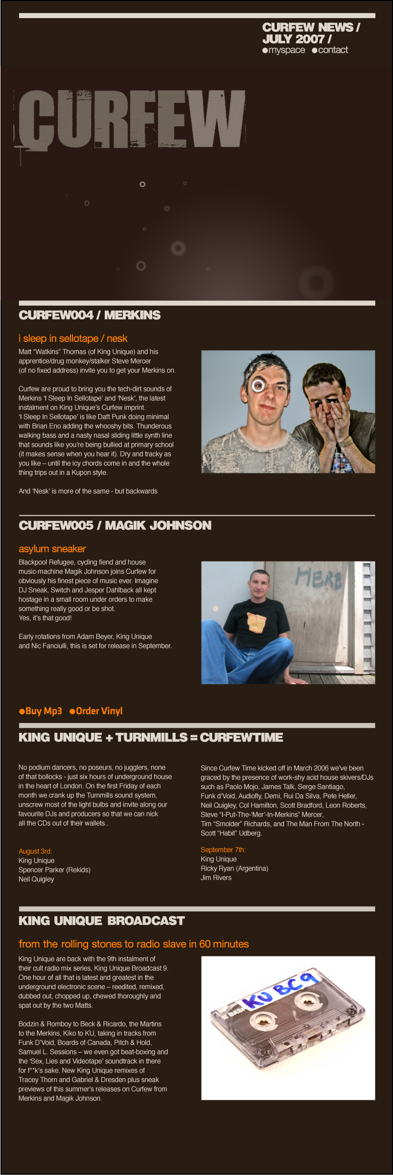
More Design Bits for Curfew


I was going to do a site, but it was obvious the first port of call would be promo emails - direct and sent straight to the right people.

the image is viewed at full size here

This is just the graphic, The page with live text and links is still in progress.

Friday 8 June 2007

Curfew - Alternative idea for Magik Johnson


This was the 1st idea I had, which could be ok, but I prefer the monochrome thing.

Mo' Summer Work for Curfew Records


This one os for our friend in Auckland Dick Johnson, who signed his new track "Asylum Sneaker" to us. The Idea with these is they go on the Legal Download MP3 stores like Beatport.

I am very into old black and white vintage stuff, and am trying to get this feel here (obviously). It's quite nice to be able to just bang this stuff out without having to do all the college faffing about :)

Summer Work / Curfew Records


This summer i NEED to make money and get some heat back on my paying DJ / Record label / proucer job, but there is a good angle where I have to make graphics for the releases. We plan at least 4 of these, and i have been messing about with vibes i like. Hopefully later i can look at adding motion to these, but for now i am just messing about with image making and type and colour.

This is for Merkins, and i was looking for a screen look, kinda vintage but not too old, and adding a bit of texture in.

Monday 4 June 2007

Wednesday 30 May 2007

The Strokes


superb new Strokes video by Warren Fu, excellent excellent excellent!

I still prefer Michel Gondry though...

Wednesday 23 May 2007

Simon Robson


FROM MOTIONOGRAPHER.COM

Even if you don’t agree with the arguments put forth in these animations (and the film), they are excellent examples of how the smart confluence of design, animation, sound design and writing—collectively known as motion graphics—can be leveraged to create compelling messages that are hard to ignore. I call these animated nuggets of information and persuasion “visual essays.” Unlike a simple PSA, visual essays intertwine educational messaging with argumentative thrusts. The result is a potent audio-visual cocktail that can, if brewed properly, alter viewers’ states of mind.

Simon has a proven track record of rocking visual essays. His “What Barry Says” still stands as a shining example of the form four years after it was created. (At least I think it was four years ago.) The new animations showcase some of the same clever juxtapositions of type and iconic imagery present in that seminal piece, but there’s a burgeoning level of sophistication and polish present in all of Simon’s work (both commercial and otherwise) that is inspiring to behold.

Simon graciously agreed to answer some questions for us:

How much input did you have on developing the visual ideas? Did Chris Atkins (the director) hand you thoroughly worked out boards or was it just you and the script?

I spent ages developing the boards from scratch. Chris totally trusted me on the back of “What Barry Says” and gave me an absolute carte blanche. It is this that inspired me to take on the project. We actually wrote the VO scripts together, too. Of course, Chris was the prime mover and Becca Elleson fact-checked all that we wrote. But I finally put my degree in politics to use and helped write the VOs for these vignettes!

The storyboard process was long and arduous. I give myself an incredibly hard time over the level of my ideas. They have to be an A++ or they don’t get in. This meant many weeks of head-scratrching and drinking coffee before the right ideas came out. I actually re-wrote some of the boards as the animation was happening. This didn’t make me any friends. But once I saw some ideas in production, they didn’t work and had to be re-written, kind of how they used to write ‘Friends’!!!

Did you have to split your time working on this project while simultaneously working on other (commercial) projects?

No, fortunately and un-fortunately I didn’t get any pitch wins during this period. This left me incredibly dedicated to this project. I got really too deep into it, in a way. And to kind of answer the next question, I gave my directors fee for this project to production to get more animators / illustrators on it. In short, I got paid nothing. I lived unpaid for 4 months. I still owe my girl £3000. Fortunately, I just got a paid gig here at Nexus, which was a huge relief. Now I can go out and by some trendy clothes and stop living on beans on toast!

Correct me if I’m wrong, but I imagine you don’t get paid much for these kinds of projects. What drives you to create things like “What Barry Says” and these new animations?

What drives me? What do I want on my gravestone? “Directed some great ads that sold stuff to people”. Not really. Don’t get me wrong. I really want to do ads, because there is a creative process to be explored (sometimes) and they pay me. But essentially ads are selling things and we’re all a bit too obsessed with buying things, so I’d rather do stuff which I think is important for people to see and take in.

Obviously I’m a bit of a lefty and this comes across in the work I take on, but I’d like my kids (when I have them) to be proud of what I did. Besides, we all learn these crazy skills, don’t we? 3D, 2D, stop-motion, etc. And it would be one MASSIVE shame if we only used them to help sell something as opposed to saying something important. Actually, as a mograph community, with what we know, if we got together in some cohesive movement we could create some amazing marketing for our cause…just a thought.

Monday 21 May 2007

Danny Yount


I have been watching this for ages, and keep having to dig out the link, so i'm putting it here for reference. It's basically state-of-the art shit. madness!

excellent first five seconds here in particular.

My end-of-the-schoolyear post - Conclusions

This year has been a real eye-opener. I have been 100 times busier than I thought I would be, and feel that I have learned a lot. It's not all totally positive, as this course packs so much in one year, it is quite hard to keep up! (In my case impossible to get a grasp of everything).

I feel I have learned my strengths and weaknesses, and I think I will try to stay on for the 3rd year to get my BA (just as insurance), as I don't plan to go back to education again now if possible in this lifetime (too old!). To avoid unecessesary babble I will do a list of my college related strengths and weaknesses:


Strengths -

1. Good at talking, blogging, communicating (in fact I think I do far too much of this!)
2. I think I have a fairly good eye for design and typography.
3. I am thorough (although this could be a hindrance at times!).
4. I know what I want to do.
5. I work hard, about as hard as I could have this year under my personal circumstances.
6. I take it very seriously.
7. I am quite good at at learning off my back.
8. I am good on the 'building-block' packages such as Photoshop and Illustrator.
9. Paperwork - I can do this well.


Weaknesses -

1. I get stressed.
2. I don't pick up software packages as quickly as I'd like to.
3. Flash - I didn't get enough time on this, and still haven't got as grip on it!
4. Self-confidence. this doesn't come easily to me. I only become confident through practice.
5. I take it very seriously - maybe too seriously!

aims for the next 12 months:

Bearing in mind I think I will try and do that extra year for my BA, thiis makes sense -

1. Refine my goals, start specialising more.
2. Practice, practice, practice!
3. Output, output, output!
4. Do more storyboarding.
5. To become a Photoshop ninja-dude. This will help with the next one...
6. Get into After Effects much more.
7. Look at some bespoke typography. I feel by having some of my own, I will up my worth and individuality etc.
8. Get a Digital SLR and start doing better photography.

that'll do. that's loads. I'm sure the evil-task masters at college will spend the next year throwing curve-balls at us, and I will be busy busy busy. Thank f*ck this years over!

Stephen Watkins


Fantastic reel from Melbourne designer Stephen Watkins here.

I love the mixture of styles, live action, photography, graphic and motion design. The other thing I like to see is different styles. British motion designers can sometimes be a bit aggressive and edgy which can be great, Americans can sometimes be overly slick, so polished it becomes a bit bland, but Australians do this effortlessly laid-back groovy style (obviously these are huge generalisations!).

I love it anyway. Great vibe, and for me, vibe is everything.

Thursday 17 May 2007

Professional Studies Revisted

I have had a really good long think about looking at the outcome of my professional studies and the related pathway for year 2 of this course, and have come to these conclusions:

Whilst I have a small interest in Motion Graphics for the web, I don't feel that I should be getting into a big stress about it. What I am and have been mostly into since the first day I arrived here in September 2006, is good graphic design, and image-making. I know Jon Burton and Martin Pritchard feel that same way; we all dig the motion part, but the majority part of what we're into and want to do is based on good image-making, typography, composition, colour, vibe and hopefully some originality. I am much influenced by Non-Format as I am by Dstrukt.

I really want to work on my layered image making next year, and I would also like to look at some bespoke typography for logo/display use. I also want to get an original spin on what's out there and avoid blandness. I am definitely interested in motion, that animated aspect, but don't really want to spend too much time on the finer ends of action-scripting if it means it's going to take up lots of time. I feel that if I will need to work more on the web than in broadcast I should be able to address this later, as I think it's quite likely that I will stay on for the extra year and get a BA.

I recognise that there is an element of 'Blue Sky Thinking' in my plan for my future career, but I honestly feel that there is little point basing future career choices on the current working environment as it is certain to change by summer 2009. I am seeing motion graphics everywhere now, it's all over the TV, idents, adverts, the news, even in my local Spar, and this will certainly increase. In addition to this, I think that to be good at this you have to be first and foremost, a good designer. This is the foundation and skills can be transferred. I am just going to stick to my guns, and try and work hard but also have some fun with it.

1 Day Brief - Centre for Disability Studies


This is one of the images i did for our 1 day work experience brief for Newi's Centre for Disability Studies.

I enjoyed the experience of doing this one day brief. The task was sat nicely within my current capabilities, as I only really started with all this design stuff 12 months ago (after I was accepted at college). When I deceided I was to leave my old job and take the leap into re-education I quickly went out and bought quite a few graphic design books on basics like layout, composition, typography, ideas etc. I then obtained copies of Photoshop and Illustrator, and set about getting my head around them (as they are quite different from the music production software I was used to like Logic Pro and Ableton Live).

I suppose it is fair to say that prior to starting college I only looked at Graphic design basics, as at that time I didn't think the course would delve into anything deeper so soon like working with Timelines, animation, music-synchronisation etc. I was wrong there! The only thing that helped me prepare was looking at graphic design over the last summer, and I think that is why I found this to be straight-forward. It was just a case of quick research, some roughs on paper, then straight onto Illustrator to get it done, which I was able to on time (in this case).

We later had another 1 day brief, which was a web banner. This was the same kind of idea, but becaise of a lack of both experience and confidence with Flash, I was unable to complete my banner in time, even though I did have a plan. More on this on my end-of-term post.

My First Website


My first website is now live: Kupon (This is the name I am using in place of my own as a brand thing).

The brief was to design and build a portfolio site for college work (and additional work if you wish to include this), and the guidelines specified it had to built with HTML and CSS. This was a big brief, and many elements needing attention; research was undertaken into the various types of websites out there (for example, I never really knew when a site was HTML/CSS, Flash, where Javascript was being used), the way they are organised, web-fonts, optimization, all things that were admittedly restrictive in the initial stages of this project.

The next stage was the design: a few initial ideas were rejected. I wanted a groovy pop art type thing, possibly inspired by this site for Masa in Venezuela , and set out to borrow some of that vibrant, colourful and drop-deal coolness. This didn't work out for various reasons; Masa's site is Flash based, their content is ridiculously good and the whole package is well balanced and rings true. My initial design (based on theirs) was never going to work, and a rethink was needed. I had researched many sites for designers, especially motion graphic artists, and found the best ones were very simple. This could be as simple as a page with some branding, contact details and a link to view or download the showreel. The sites of Lawence Zeegan, Ugo Nonis and Neil Grunshaw are all good examples of this.

The design was reworked with this in mind, but based around my college work as a portfolio. I feel that that this will change, as I think I would like to include other work in future, or more things I fell are good, however this site needed to get done, so I put together an understated and site. The idea is meant to be that the site itself takes a back-seat, and the work shines; although I don't really have work of that calibre (yet!) Particular attention was paid to the grid, typography, web-safe fonts, spacial harmony (and all those other things you get for free when you do a blog). The design was specifically built around the college work I had at thetime, however I have plenty of space within my grid to change this in future, guarenteeing that this site will be good for another year.

The next stage was the coding. HTML and CSS was initially intimidating. It looks like it will be really difficult, but I now realise it's just a case of problem-solving. I think if tweb becomes a speciality there are loads of 'rules' that need to be adhered to, such as accesibility, content-management systems, minimal coding and web standards. This was our first sites, so all of us in our group have tried to incorporate 'good practice' and the latest web-trends. The practical lessons for this brief were very good, comprehensive enough to get thinking CSS, but as an added measure and on the recommendation of NWSAD's resident web-geek in residence Tim Makin, I purchased Patrick Griffith's book HTML DOG, which is very good, and is less than 6 months old so has most of the latest web-fads in.

I think it could have been possible to get other people to do little bits of the coding for me, but I want to be able to keep doing websites. I have my label and club night, Curfew, which urgently needs attention, and over the summer I plan to use this as my muse, with plans for a customised word-press blog, a portfolio type site (possibly in Flash) and plently of graphics, web banners etc. This will keep my hand in with web, as I will not be specialising in web-design. My mate Andy Olley at Bruce Dunlop doesn't do web, and hasn't done for the last 6 years for his day-job, but he is not adverse to knocking out the odd site on the side for a bit of extra cash and to keep his hand in. His sites are simple, but look great as he is good on the design side, and it works for him. I like the idea of this, and plan to do the same.

To conclude my feedback on the site, I would say that I was basically happy with the site as first attempt. The site hasn't been tested in IE (any version) yet, and there are still a few bugs, but I know I will be able to fix this. I also plan to adapt the site to incorporate more flexibility for adding more content over the next twelve months.

Monday 14 May 2007

More Typography Video


Another one. After Effects etc. It's good though.

Type and Motion


a clever and compelling trip through design history, from Mucha’s elaborate compositions in the late 19th century all the way up to the 3D-dominated glossiness of the present day.

Monday 7 May 2007

Oliver "Twist" Gondry


I am a huge fan of Michel Gondry and his brother Oliver. Thier work has been consistantly technically mind-boggling, yet the result is always a human, always true to life in some way. I quite like 3d and vfx stuff, but only really in this way (most maya type 3d kids cartoons are horrible).

This spot shows how much input Oliver must have in many of Michel's videos.

Sunday 29 April 2007

Summer School & Bruce Dunlop Associates

I recently filled out an application for McCann Erickson's Summer School program in Macclesfield. This could be a great opportunity to gain work experience. Here's what was said:

1. What was the last big idea you had? (Not related to advertising or business.)

My wife and I have two daughters, so I would say my youngest daughter was the last big idea.

2. What bribes/qualifications do you have that would convince us that you’re cool enough for school?

Since the early 90’s I have worked as a record producer, remixer and globe-trotting DJ (this pays enough to fund my return to education). Years of travel have given me a real insight into spotting global trends plus a good understanding of the universal language of branding.

3. Have you any idea of what you’re getting in to?


I think I have a pretty good idea. Brainstorming, team-playing, and good old-fashioned hard work should factor highly.

4. Where would advertising be without the internet? (Max 100 words).
Oh and what site do you visit the most?


I would say that good advertising has always been about fresh ideas and timing. In recent times however, viral marketing/advertising has revolutionized advertising, breaking the stronghold of the major TV stations and their biggest shows. This means more quantity and variety in advertising, (the best ideas can as easily come from a college student or a huge agency). The internet also has a global reach. The mainstream ad agencies are starting to re-appropriate the best viral/p2p ideas.

My most visited site is http://www.motionographer.com/ - A design portal which concentrates on Motion Graphics. Many of the world’s best ads, idents and music videos are posted here.

5. You’ve just entered the Dragon’s Den. Use no more than 100 words
to pitch your award winning business idea.


Natra-Pak - Biodegradable packaging for food: Kellogg’s annual turnover alone is $100, thus creating billions of tons of waste via packaging. My business has pioneered 90% biodegradable bags, made out of vegetable matter. These bags have a standard zip lock to reseal the food product within for freshness (the handle part can be snapped off and re-used on further bags).

The manufacturers can choose to place these bags within cardboard boxes (which can be recycled), or simply sell in branded bags.

6. The Dragons seem interested. Explain how you would reach your customers
and then how you plan to expand your business in the future. (Max 100 words.)


The product would be initially sold to the big cereal manufacturers, upping their virtually non-existent green credentials, thus helping them to be seen as ‘saviours of the environment’. The current pressure on businesses to be seen to be doing something about the environment will grow over the next decade, and this product will help pre-empt this problem.

The big cereal manufacturers such as Kellogs and Nestle’s upfront investment and early use of this technology (which will surely become industry standard in future) can be used as a big publicity stunt. Patented technology will enable us to license the product globally, used across many more types of food packaging.

7. Tell us about a trend that’s going to change the way we look at things?

Integration and synthesis; the recent shift towards higher, cheaper bandwidth, and cheaper technology will mean more screens. The combination of images, video and sound, once restricted to television and movie advertising can additionally be shown to similar effect on any screen from mobile phones, electronic billboards and any modern computer, all connected to the web wirelessly. I predict that it will be increasingly difficult to avoid these in any urban environment (this is already happening, but this is just the tip of the iceberg).

8. Our swimming pool is redundant 99% of the time – what would you do with it?


Throw it open to the public, free, as an advertising stunt.


9. And finally, why do you not want a proper job?


I do. This is to help get me one!


McCann Erickson rang me the other day, and I now have to go there and do a 30 minute presentation, as a secondary vetting stage. If this is successful, it looks like I will be at the summer school. I have come to realise that with a bit of time, I can appear to have the gift of the gab (on paper), however in real-life and in real-time I am not so good at it.

In addition to this summer school, I have made arrangements to work at Bruce Dunlop Associates Sydney office for a week whilst I am over there touring. Final details are yet to be arranged, but this is a bonus for me as I will already be out there doing a small DJ tour which will pay fairly well. In the past I had always spent the week between gigs chilling, but I didn't want to waste my time this time. This solution is ideal. I will be massively jet-legged whilst being dropped in the deep end with a real firm who do exactly. lovely!

EVB


EVB have embraced the convergence of broadcast and interactive markets (and production techniques) for a long time. Their philosophy sums it up nicely:

“The digital consumer is not media captive, as yesterday’s consumer was. They have the ability to filter the marketing messages they receive. They are born multi-taskers that jump from device to device and media to media with the touch of a button or a click of a mouse. As a result, advertising has become easier and easier to ignore. And the content that fills those digital devices has become king.”

This mix up of broadcast motion graphics and interactive is very interesting to me. It outs a strong case forward for trying to learn 3d, After Effects and Flash.

This week I have been mostly into integration and synthesis.

Sunday 22 April 2007

Critical Studies Essay Vol 2

I had a total nightmare doing this second critical studies essay. Maybe it was a case of the first one being comparitively easy, or maybe the more likely explanation was that I went off on a mission, trying to steer the question around to something I was more enthusiastic about.

I spent 2 weeks+ putting tons of quotes,links and text into a blog, trying to bring enough ideas into it to fill a 300 page book. When I read what I had started, I realised immediately that it was confused and made no sense (even to me!), and that it wasn't really answering the brief. I have since started again, simplified it down to the basic question, and managed to finish the second attempt in 4 (busy) days. I must admit this is the least enjoyable part of the college course by miles and miles.

Student Work from Canada

This is what some canadian students did in their grad show.

Lawrence Zeegen


Lawrence Zeegen runs the graphic design and illustration course at the University of Brighton, and wrote the book 'Digital Illustration', which I found very useful. He is amongst other things, an image maker and utilises technology and computers to create his work. He seems to have a liberal outlook, and I found his book very approachable. Unlike many in the world of art, he avoids using tedious jargon to over-complicate his books and justify his position. This makes his books invaluable. (I read Digital Illustration prior to doing my character design brief).

The other reason he is here is because he has a great CSS site, and I am currently building mine. His site is in the same style as his book, in fact it is cleverly almost the same. Great design and branding, which is a good example to me all round.

I emailed Lawrence for a bit of future networking, and to try and find illustrators / image makers to collaborate with in the future. Collaborating can be great if it works out (this was the case in my past music job, where I always worked with another person). 1+1 can equal 5.

here's Lawrence's reply:

Hi Matthew

Thanks for your email and the posting - just a small point, you got my surname wrong -Zeegen not Zeegan!

I do have another book on the go - Secrets of Digital Illustration - out in Aug/Sept.
Also- did you see The Fundamentals of Illustration (AVA)? That came out late 2005.

I might be interested in getting some of work moving - what's the deal..?

all the best

Lawrence

Collaborators

In the next college year I hope to collaborate with a good illustrator (or a graphics student keen on image creation), or even an animator. The idea is, that I get my Motion Design skills at least up to some kind of working level level, enough to blag my way into a more ambitious collaborative project.

I have worked out enough to know by now that it might not bear fruit at first attempt, but all parties ought to learn a lot. If it did work out very well (you never know), hopefully it'd be a very strong project that could be used for any of those competitions (or something of that effect). I would be happy for either outcome or anything in-between.

I have put a post on the Blackboard, but I can't tell if any of the students look at it (although I have found out the some of the teachers definitely do :) )

Witness The Slickness

Friday 13 April 2007

Are JPEGs the New Album Covers?

Great article from Adrian Shaughnessy, which is particularly relevant to me, as I am now doing a running live brief for music graphics for Curfew.

Saturday 7 April 2007

Slick Reel from The Big Hitter - Imaginary Forces


This high-end superslick reel speaks for itself. This is great for that type of thing, and the editing on the reel is perfectly executed.

Friday 6 April 2007

WE FAIL


Wow. I think I have finally really found some web designers that both really impress and float my boat! I had seen all those Hi-Res! bits, and really liked them, but i finally got around to checking WE FAIL out, and I am totally impressed.

WE FAIL's site for Eminem is pretty groovy and a good example of where Flash as been heading more recently with web video. It's still doesn't quite has that sense of "reality" you get when when you watch a quicktime video, there still that bit of glitchyness, but Flash video is already here (everyone watches youtube don't they?). There is also some audio issues with direct synchronisation not being ideal, but it is really getting in the right area.

The Eminem site does a great job. I also noticed that If regular stuff like information is needed there is a separate Eminem HTML/CSS site which can open in a new window. This is a “total” web solution can be done, covering all bases. There are horses for courses when it comes to web work, and if the client can afford to pay for the extra work, why not have your cake and it it too? I can now see where a web company might need staff coming from all sorts of disciplines.

I had read all about WE FAIL in Creative Review. It's a collaboration of and American guy and a Brit who have only ever met a few times, and work in different countries. They did come across slightly gobby, but now i have looked at their work it makes sense. They are pretty irreverent, and maybe that's what the sometimes po-faced Flash community needs anyway!. It seems they have the talent, and can make it work. This inspires me for various reasons, not least because I live in Wrexham, and can't go off moving to London. All I need now is that talent...

Thursday 5 April 2007

Boards Of Canada Artwork


I like Boards of Canada. Not everything they do mind, cos a lot of it is twiddly fiddly nonsense, but they have done some real killers, and their recent artwork is nice too. After their initial "sci-fi" look of the 1st two LP's, they seem to have gone for a retro graphic look. This is definitly a thing I want to find out how to do (because you can do some great graphic things in Adobe Illustrator, but they always look pristine. Where's the retro button?). This retro thing is also refelected in the videos for "Dayvan Cowboy" and "Trans Canada Highway".

This retro graphic style is also used to fantastic effect on the Vitamin Reel

My music partner in crime Matt "Watkins" has pointed out the fact that all the footage they use in their videos is royalty free retro stuff, which anyone can use, which is nice! (although i dare say there is an art to matching it to the music so well). Luckily I have one skill from my previous work that ought to come in handy.......

Ugo Nonis


I don't know loads about this guy, except he's some hotshot art director who used to work at Eyeball, and his work is really refreshing and vibey. This is also reflected in his site which like many other people in the broadcast business is straight to the point (you basically get an email address and the reels), but presented in wholly fresh way. It kinda reminds me of Michel Gondry's music videos for some reason. Personality. It's inspiring stuff!

To be followed up....

reel - everything from scribbly biro doodles to stop motion and flashy stuff, all glued together.

Monday 2 April 2007

The Professional Studies Assignment - Conclusions

I have reasearched my Professional Studies Brief (which can be viewed in the link above).

I have been able to find out enough from my research to draw these conclusions: I am interested in many areas of Digital media, but it is obvious that one man alone cannot do everything, and if this was attempted, it would certainly be a case of “jack of all trades, master of none”. I had this idea before I started that I would like to look at Motion Graphics and Typography (the more Logo / Display variety), and I think having had a really good look at what's out there and practicioners in that field I realise that this is a viable option.

My professional studies assignment got me to look at a range of work, both things I am interested in and things that are going on within commuter distance to where I live here in Wrexham. I suppose it would be fair to say that if I was looking at this from the view of what is out there where there are jobs available I may have decided to switch to a web design or even print design path, but whilst I like both these I don't really have a passion for it. I'd like to be able to be really into what I am doing, and I think by concentrating on motion design I will be.

There are factors that have helped me decide:

The character design brief: The layering and collage of images are techniques that would be used lots in this field, Photoshop and after effects projects could be built in a similar way.

The Fusion of graphic design / image making, animation and music (my old job was in music) is dynamic and natural to me (well at least working with music on a timeline is. the animation could be hard, but I'll cross that bridge when I come to it)

I feel that this area is really building right now, and my research found that there is a shortage of really good motionographers in the UK. Freelance rates for experienced designers are £250-300 a day, and thier expertise is in high demand. I also think there could easily be more of a fusion between motion graphics on the web and motion graphics for broadcast. Despite many differences, both Flash and After Effects work on a timeline, (although Flash has always been notoriously bad at sound synchronisation), there is scope to work within braodcast media and for net based work.

I will keep a hand in with web design in some format, but I wouldn't approach it in the same way that one of my fellow students would if they were to specialise is this field. I think by doing the odd website, possibly more in keeping with what I will be doing with motion work or a simple portfolio site for myself should be enough to keep in the loop to some extent. If I required to do anything more for a site, i'm sure I could collaborate with a web-developer.

My research for the professional studies brief is here

Wednesday 28 March 2007

Colour


I have been really into getting a grip on colour over the past few months. Various methods have been utilsed, such as taking screen shots of great colour combinations and creating custom swatches, or using the Colour Palette Generator.

The character design brief also helped, as it made me think of reduced colour palettes, and by screen printing you can make a fresher image that is more within a tradition of graphic design, and gives variety from the usual web-technicolour thing.

Character Design


This brief required us to study people in their environment, take photos, go out and sketch and observe people. We then had to explore various media to compose and illustration. Screen and Mono printing were encouraged and we were given more time to finish and experiment.

I admit to having trouble initially getting the characters and environment down in my sketchbook, as I felt a bit paranoid trying to draw and photo strangers in Wrexham. It's the kind of thing that could land you with a punched face. My kids luckily were on hand as plan B, and I was able to abstract my two loveable little daughters into a pair of mini gangsters. I wouldn't have considered myself “good at drawing”, but have found by repeated work on the same characters and trying lots of different ways of mark-making you can still get a good enough result.

I read a book on Digital Illustration by Lawrence Zeegan which I found highly beneficial and inspiring. It helped the brief make sense, and meant I was able to recognise the methods the tutors were suggesting and have a go at it. On reflection I think it was the easiest assignment, and the only one that didn't really stress me out. I'd love to be able to integrate this kind of thing into my design work next year.

Digital Identity


This assignment required me to analyse myself and come up with a visual identity, or a logo which could then be used for our website and so forth. I found this assignment really interesting, and created a large amount of paperwork, exploring various aspects of typography, lots photography shooting a 3d version of one logo idea, worked with brush and ink, scanning and combining all of this in the computer. I researched this quite a bit, reading Naomi Klien's “No Logo”, Christopher Simmons “Logo Lab”, and the first edition of “Logo Lounge”.

I'd love to be able to create strong iconic logos. It is something that seems simple, but I think is probably one of the most difficult things to do well in design. Paul Rand was a master of this, and I also see a lot of very interesting branding and logo work today in the motion graphics area, which I am most keen on. It seems to me that the big companies utilise talented designers to make cutting edge pieces that integrate the branding of thier companies such as Nike or MTV. Chris at Dstrukt is adept and turning typographic logos into dynamic 3d objects and basing much of this work around them.

My reflections on this project are:

I enjoyed working on it, got my hands dirty and experimented a lot, but I don't really feel that I have came up with a logo I am really happy with.

Four examples shown here show different angles. I put the most time and effort into the “K” idea, but Adam here at NWSAD didn't like it at all and urged me to use a digitised version of a hand-drawn one I did quite early in the process, as it rang true with my personality. I had trouble getting a decent reproduction from the scan, and wanted a vector version that could be used at any scale, so it was redrawn with a wacom tablet. This version (in red) was still a bit rough even though it had the right character, so I subtly reworked it again for my website with Illustrator. It will do for now, but I don't know if I'd want to use it permanently.

Friday 16 March 2007

Top Tips for Art School Fuckwits

The Top 10 Things They Never Taught Me in Design School
by Michael McDonough

1. Talent is one-third of the success equation.
Talent is important in any profession, but it is no guarantee of success. Hard work and luck are equally important. Hard work means self-discipline and sacrifice. Luck means, among other things, access to power, whether it is social contacts or money or timing. In fact, if you are not very talented, you can still succeed by emphasizing the other two. If you think I am wrong, just look around.

2. 95 percent of any creative profession is shit work.

Only 5 percent is actually, in some simplistic way, fun. In school that is what you focus on; it is 100 percent fun. Tick-tock. In real life, most of the time there is paper work, drafting boring stuff, fact-checking, negotiating, selling, collecting money, paying taxes, and so forth. If you don’t learn to love the boring, aggravating, and stupid parts of your profession and perform them with diligence and care, you will never succeed.

3. If everything is equally important, then nothing is very important.
You hear a lot about details, from “Don’t sweat the details” to “God is in the details.” Both are true, but with a very important explanation: hierarchy. You must decide what is important, and then attend to it first and foremost. Everything is important, yes. But not everything is equally important. A very successful real estate person taught me this. He told me, “Watch King Rat. You’ll get it.”

4. Don’t over-think a problem.
One time when I was in graduate school, the late, great Steven Izenour said to me, after only a week or so into a ten-week problem, “OK, you solved it. Now draw it up.” Every other critic I ever had always tried to complicate and prolong a problem when, in fact, it had already been solved. Designers are obsessive by nature. This was a revelation. Sometimes you just hit it. The thing is done. Move on.
5. Start with what you know; then remove the unknowns.
In design this means “draw what you know.” Start by putting down what you already know and already understand. If you are designing a chair, for example, you know that humans are of predictable height. The seat height, the angle of repose, and the loading requirements can at least be approximated. So draw them. Most students panic when faced with something they do not know and cannot control. Forget about it. Begin at the beginning. Then work on each unknown, solving and removing them one at a time. It is the most important rule of design. In Zen it is expressed as “Be where you are.” It works.

6. Don’t forget your goal.
Definition of a fanatic: Someone who redoubles his effort after forgetting his goal. Students and young designers often approach a problem with insight and brilliance, and subsequently let it slip away in confusion, fear and wasted effort. They forget their goals, and make up new ones as they go along. Original thought is a kind of gift from the gods. Artists know this. “Hold the moment,” they say. “Honor it.” Get your idea down on a slip of paper and tape it up in front of you.

7. When you throw your weight around, you usually fall off balance.
Overconfidence is as bad as no confidence. Be humble in approaching problems. Realize and accept your ignorance, then work diligently to educate yourself out of it. Ask questions. Power – the power to create things and impose them on the world – is a privilege. Do not abuse it, do not underestimate its difficulty, or it will come around and bite you on the ass. The great Karmic wheel, however slowly, turns.

8. The road to hell is paved with good intentions; or, no good deed goes unpunished.

The world is not set up to facilitate the best any more than it is set up to facilitate the worst. It doesn’t depend on brilliance or innovation because if it did, the system would be unpredictable. It requires averages and predictables. So, good deeds and brilliant ideas go against the grain of the social contract almost by definition. They will be challenged and will require enormous effort to succeed. Most fail. Expect to work hard, expect to fail a few times, and expect to be rejected. Our work is like martial arts or military strategy: Never underestimate your opponent. If you believe in excellence, your opponent will pretty much be everything.

9. It all comes down to output.

No matter how cool your computer rendering is, no matter how brilliant your essay is, no matter how fabulous your whatever is, if you can’t output it, distribute it, and make it known, it basically doesn’t exist. Orient yourself to output. Schedule output. Output, output, output. Show Me The Output.

10. The rest of the world counts.
If you hope to accomplish anything, you will inevitably need all of the people you hated in high school. I once attended a very prestigious design school where the idea was “If you are here, you are so important, the rest of the world doesn’t count.” Not a single person from that school that I know of has ever been really successful outside of school. In fact, most are the kind of mid-level management drones and hacks they so despised as students. A suit does not make you a genius. No matter how good your design is, somebody has to construct or manufacture it. Somebody has to insure it. Somebody has to buy it. Respect those people. You need them. Big time.

Wednesday 7 March 2007

Merkins


Our record label "Curfew" releases dance music, and whereas at one time it was about the packaging of vinyl records, these days it is increasingly all sold on the web as mp3's on sites like Beatport.

These are possible web banners / graphics for those sites. I wanted to try working with colour, and a like the 3d type idea, although this is all done with a small rectangle. I am still not sure whether it looks right, but it is miles better than the last ones i did three months ago. I hope to be able to master this stuff in the next year or so, as I could get plenty of work. I know everyone in that particular niche market.

As a general thing, I really want to work on my basic design skills, composition, layout, grid, just get my eye working better! Where possible I would like to do plenty of these little jobs alongside my college work. I am never really happy with my composition so far, but am confident that it will fall into place with more practice.